From Bean to Bar: Chocolate Packaging for Makers and Fans
Sponsored by TheCustomizeBoxes.
Chocolate lovers of the modern era don’t just buy chocolates wrapped in average paper. They prefer to buy chocolates whose packaging is a perfect blend of aesthetics and creativity. Whether you are an artisanal or mass-market chocolatier, your packaging must elevate sensory experience for consumers.
Wondering how to do that? Don’t worry, this blog helps you turn your chocolate packaging into a moment of indulgence. Ensure your chocolates stand out in a competitive market by making the right packaging choices. Read on!
Choose the Right Packaging Material
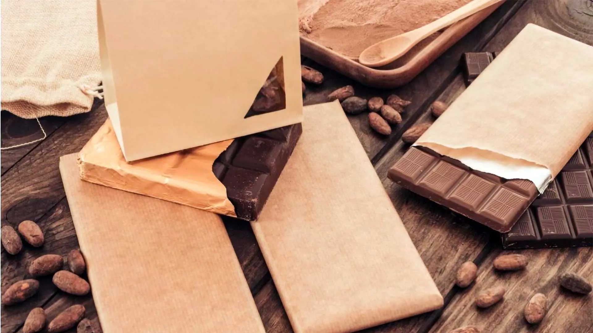
The material you choose for packing chocolates significantly affects your consumer perception. With the right material, you not only lock in chocolate richness but also boost your brand awareness. Means your customers enjoy a savory experience long after their first bite.
But here’s the thing: there are several types of packaging materials. Each type serves different purposes. For example, if your goal is to utilize your chocolates as a key tool for branding and marketing. Printed tin packaging with premium finishes is designed to do that.
The natural sheen of tinplate with high-resolution graphics and vibrant colors offers a “work of art” quality that conveys a premium image of your brand. Opening a sturdy tin creates a “satisfying” and sensory moment of anticipation that disposable plastic or paper cannot replicate, fostering an emotional connection with the brand.
On the other hand, if you choose foil wrappers for your chocolate packaging. They offer chocolate lovers a premium and clean look while acting as a barrier against external odors, light, and moisture.
Even though chocolate brands have been using foil wrappers for decades, it’s time to shift your focus to eco-friendly values, too, because Gen Z buyers prefer to buy from businesses that balance sustainability with style.
That’s where you can take the best advantage of custom cardboard boxes to attract eco-aware consumers. Like foil wrappers, these boxes also preserve the freshness of chocolates while protecting delicate bars from damage and external contaminants.
Also, cardboard packaging boxes enhance the visual appeal of your chocolates in the saturated market due to their endless customization. Designed with vibrant colors and sleek designs, they exude a luxurious image of your brand.
Apart from improving shelf appeal for your chocolates, cardboard boxes promote environmental sustainability. Derived from biodegradable or recyclable materials, they easily break down in landfills, unlike foil wrappers that persist there for years, having a negative environmental impact.
Unveil Design Secrets Behind Catchy Chocolate Packaging
A sweet spot is “packaging design” where forward-thinking chocolate brands win. Those brands design chocolate packaging to evoke feelings of indulgence, joy, or excitement in chocolate lovers.
Before designing, define your brand narrative, whether it's nostalgia, luxury, artisanal, adventure, or sustainability. If your brand’s narrative is luxurious, use deep jewel tones, black, gold foil accents, and high-quality textures, like embossing and debossing.
But if your brand is eco-friendly or artisanal, use kraft paper, earth tones, minimalist designs, and recycled materials to highlight sustainability. For playful brands, bright colors, whimsical fonts, and fun illustrations are the best design choices.
For instance, Mast Brothers is an American artisanal chocolate company that not only sells chocolate, but they also sell a “Brooklyn artisanal” lifestyle. They presented themselves as pioneers of the “bean-to-bar” craft movement and targeted consumers who valued authenticity, local production, and premium aesthetics.
Mast used nautical themes and vintage, old-timey designs on chocolate wrappers to set a “general store” vibe. It changed its packaging annually, working with designers to create custom and artistic patterns that acted more like paintings or textiles than typical food packaging.
Also, the respective brand used thick, high-quality paper, and its chocolate packaging communicated craftsmanship and justified premium pricing. The result? The visual identity of Mast was so strong that it often overshadowed the product, turning the bars into highly shareable, giftable items. The brand packaging became the “calling card.”
You can also emphasize “bean-to-bar” authenticity by utilizing imagery and illustrations. Such as hand-drawn illustrations of cocoa plantations, maps of origin (e.g., Madagascar or Peru), or local flora and fauna.
Or create whimsical illustrated characters that reflect the flavor profile of each bar. Also, you can use patterns that convey the mood, such as energetic, calming, or decadent. The best example is Mirzam Chocolate Makers, a bean-to-bar chocolate maker in the UAE, which uses intricate, dreamy illustrations to highlight the history of the spice route.
Their packaging features hand-drawn, whimsical illustrations that narrate the journey of cacao beans from exotic locations. As an interesting fact, the brand illustrations act as a “storyteller,” creating a high-end, artistic, and memorable gift-worthy product that stands out from minimalist competitors.
So, the whimsical art allows the Mirzam brand to educate consumers on flavor profiles (e.g., using nautical or botanical themes) in a charming, non-academic way.
Another Brooklyn-based chocolatier, Raaka, uses abstract photography and custom typography to represent their unique flavor profiles. Instead of traditional ingredient pictures, Raaka uses vibrant, abstract backgrounds created from photographs of their cacao sourcing locations.
Their design team, DesignStudio NY, aimed to elevate the “uncommon and vibrant flavors” of unroasted chocolate. The abstract imagery helps consumers emotionally connect to the flavor rather than just seeing a picture of a coconut or berry.
Talking about a conceptual brand, Xonochoco, uses quirkiness to target younger consumers. For this purpose, they are leveraging the legend of aliens in the Aztec region. Their packaging features cartoonish, alien-shaped illustrations inspired by Aztec art with modern pop-culture aesthetics.
This approach offers high visual differentiation from traditional yet sophisticated dark chocolate brands. Hence, illustrations by Xonchoco immediately signal a "fun" and "adventurous" brand personality. Their design merges historical context (e.g., Aztec origin) with a modern, rebellious, and artistic style.
By taking inspiration from these brands, you can also match your brand’s artistic theme and make your chocolates recognizable on crowded retail shelves.
To Sum Up!
Undoubtedly, the pristine flavor of your chocolate is the core theme of your brand. But its packaging will attract customers at first glance. Ensure customers don’t leave your chocolates on shelves by choosing the right materials and designing appealing chocolate packaging, as discussed in this blog.