Visualizing Flavor | #PSC 220
OVERVIEW: Episode 220 of #PodSaveChocolate takes a look at flavor visualizations, how they may influence the way flavors are perceived, and more. Are some presentation formats better than others? Should some entire approaches be deprecated? [updated]
Links below to watch LIVE and to view the archived episode.

Watch and comment LIVE or view the archived episode!
Subscribe (free!) to the @PodSaveChocolate YouTube channel, like this video, comment, and share this episode to help grow the #PSC community.

Watch and comment LIVE or view the archived episode on LinkedIn.
Join my network on LinkedIn to receive notifications and to refer business to each other.

Watch and comment LIVE or view the archived episode on TheChocolateLife page on Facebook (for 30 days, then watch the archive on YouTube).
Follow TheChocolateLife on Facebook to receive notifications and catch up on other content.
Episode 220
I’ve been thinking about flavor a lot recently, as a part of a larger effort to understand how chocolate is classified, compared with beer, wine, spirits, coffee, and cheese. (In this grouping, chocolate and cheese are the most alike.)
I think one thing holding chocolate appreciation and connoisseurship back is that there is no widely accepted framework for organizing chocolate that is based on first principles, not a reverse-engineered taxonomy.
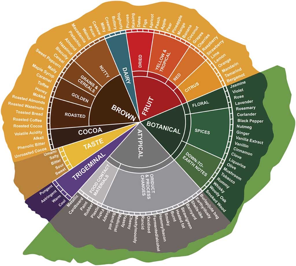
Many of the popular approaches to visualizing taste have been influenced by the wine wheel introduced by Ann Noble in 1984. Beer and spirits (not shown here) and coffee and chocolate (shown in this post) have built on the wine foundation.
My questions include:
- What is the purpose of the wheel as a method of conveying information?
- How is the wheel used as an aid to education, evaluation, and judging?
- Chocolate is not a two-dimensional experience. It is multi-sensory and it takes place over time. Ann Noble’s wine wheel was introduced over 40 years ago … what visualization innovations have taken place since then?
- Going back to first principles, should flavor be the single most important dimension when evaluating the “quality” of chocolate?
- Added: Inputs vs outputs
- Added: Ease of comparison
- Added: The contribution of area
- Added: The influence of color choice
I will be exploring those ideas in depth in this episode.
Comparing Visualizations
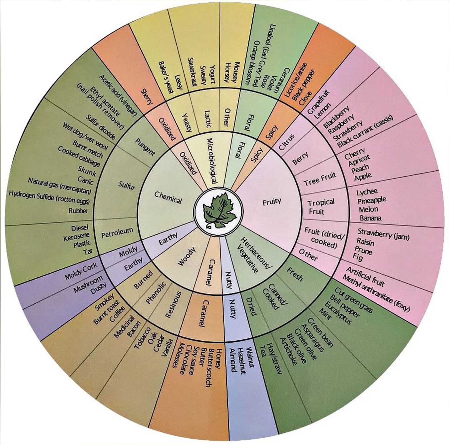
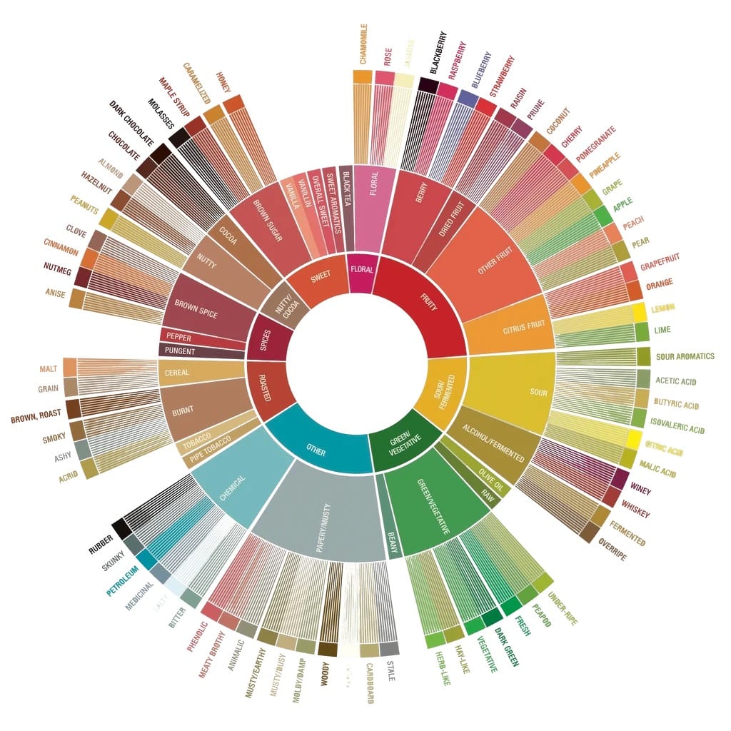
[L]: Wine flavor wheel. [R]: Specialty Coffee Association flavor wheel.
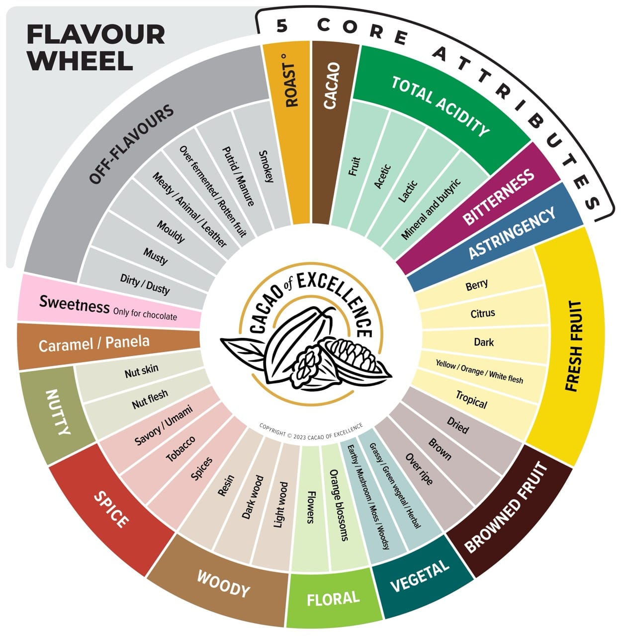
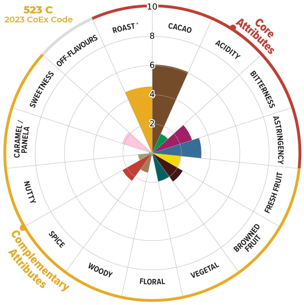
Cocoa of Excellence current wheel and how how it is used in judging.
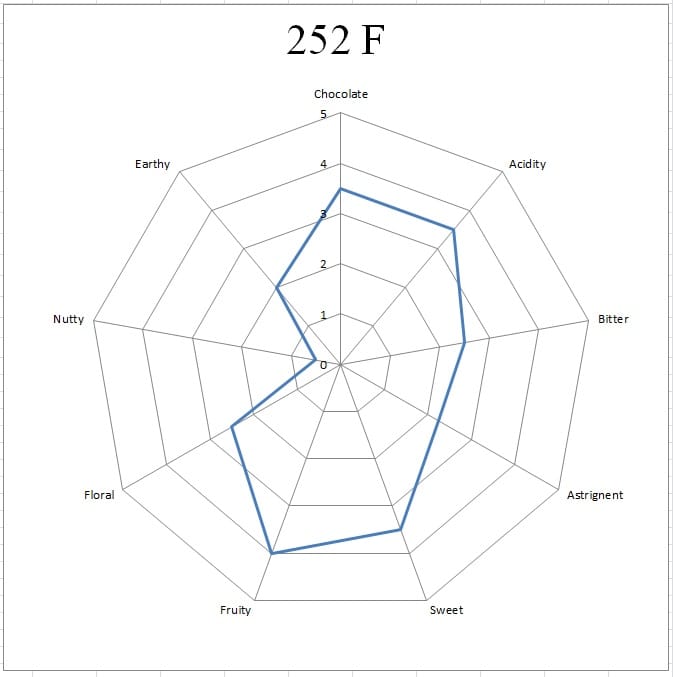
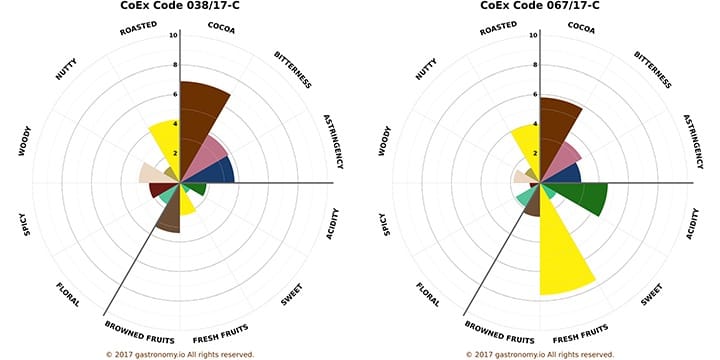
The OG “spider graph.” The format for the “radial pie chart” graph (as a replacement for spider graphs) was proposed and developed by me for the 2015 edition of the CoEx and has been used by MOCCA, among others.
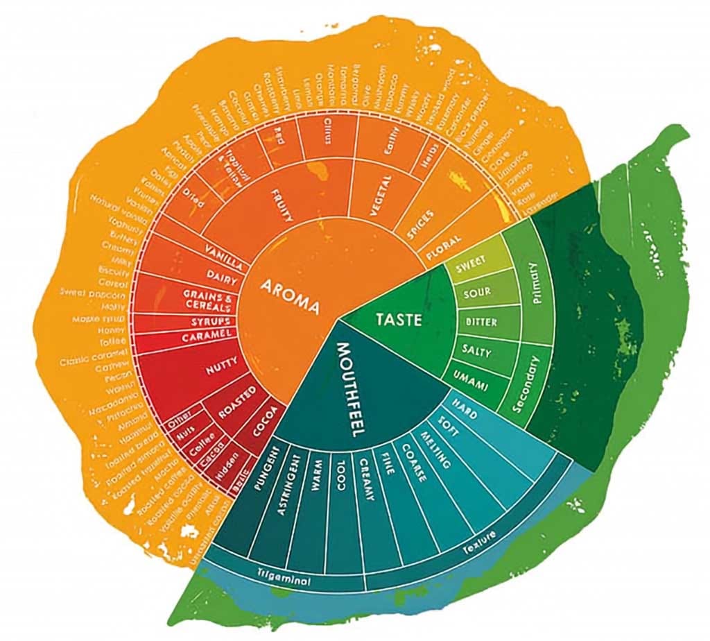
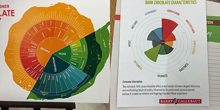
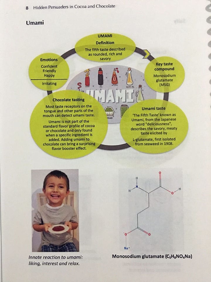
Hidden Persuaders in Cocoa and Chocolate was launched in February 2018.
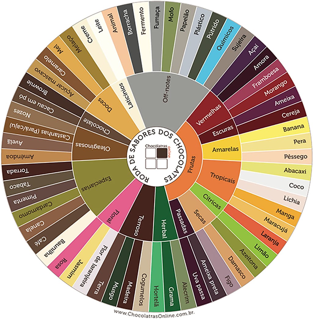
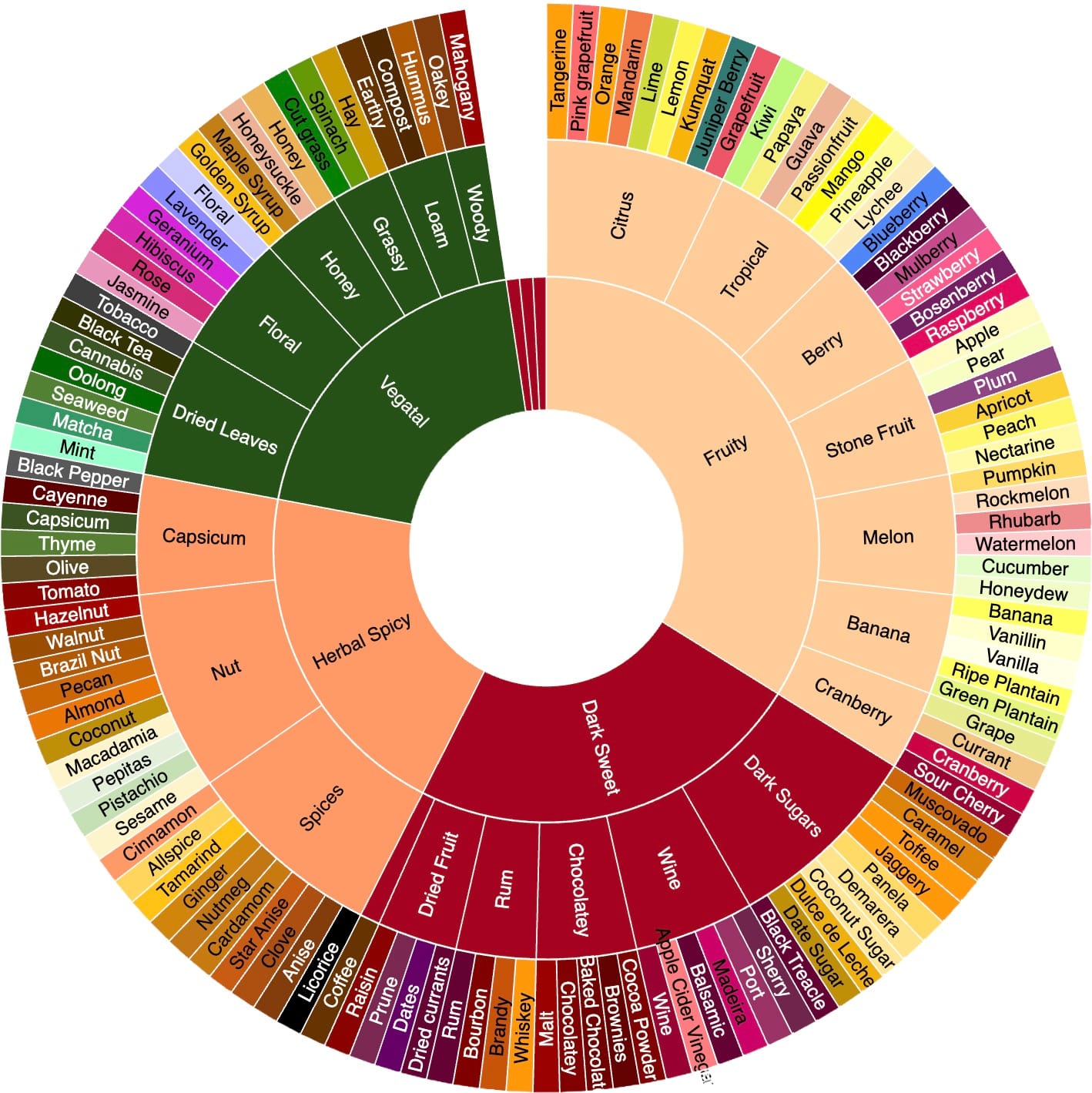
[L]: Chocolatras chocolate flavor wheel; [R] beanstalkr flavor wheel.
Alternatives to Wheels
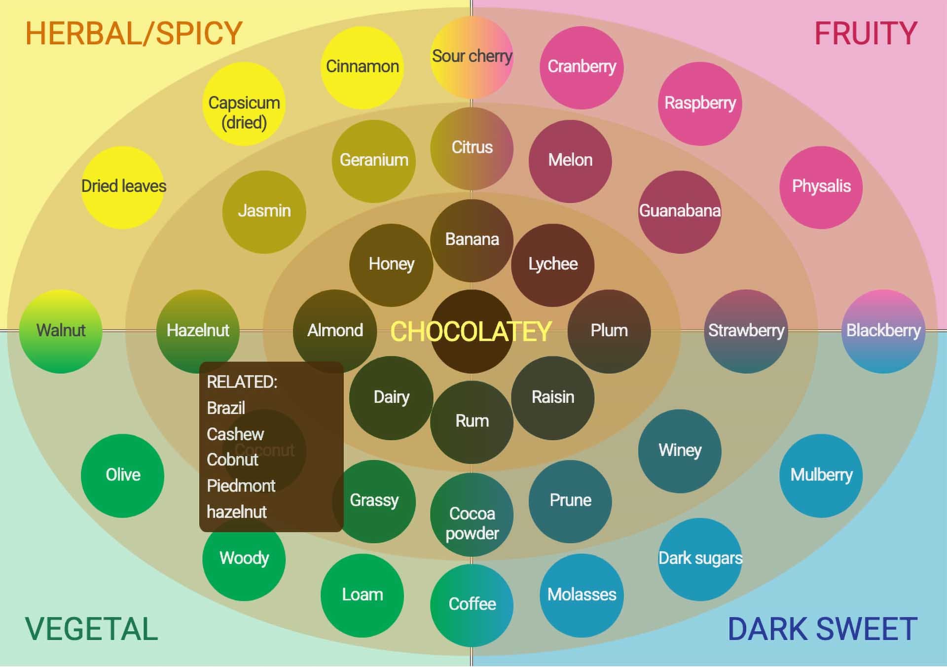
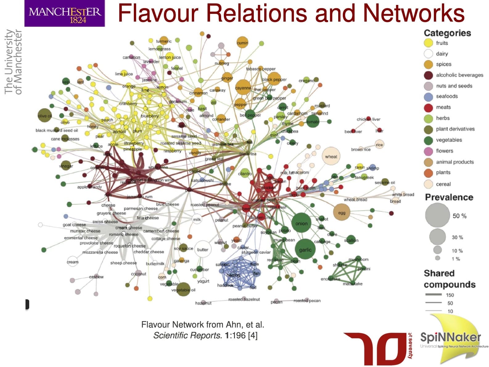
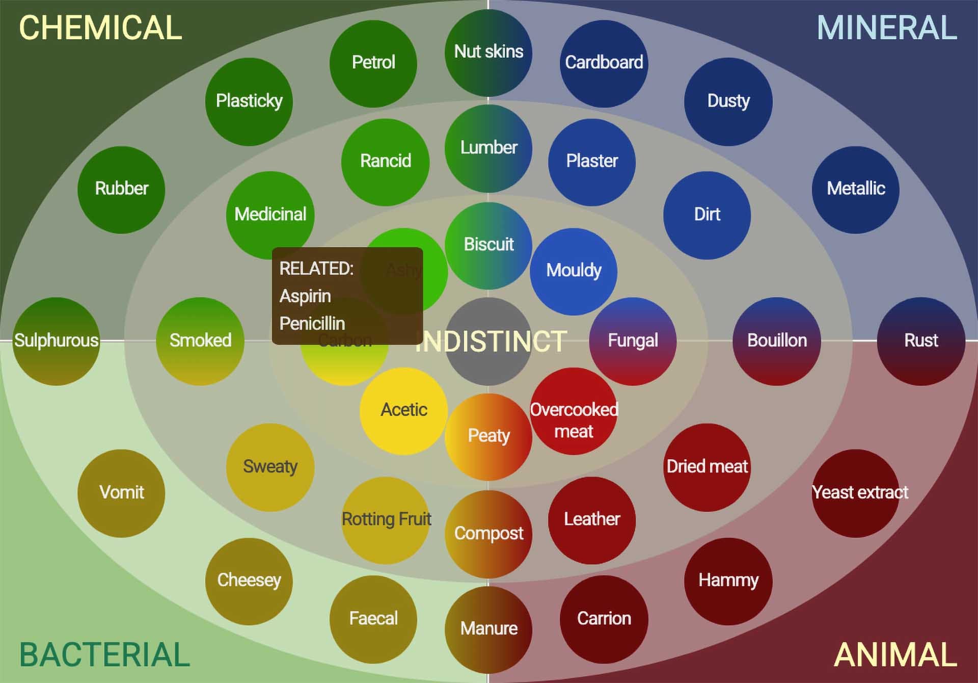
How the IICCT visualizes flavors. [L]: Positive flavor attributes. [C] The bridge from chemistry to experience and association. [R]: Defects.
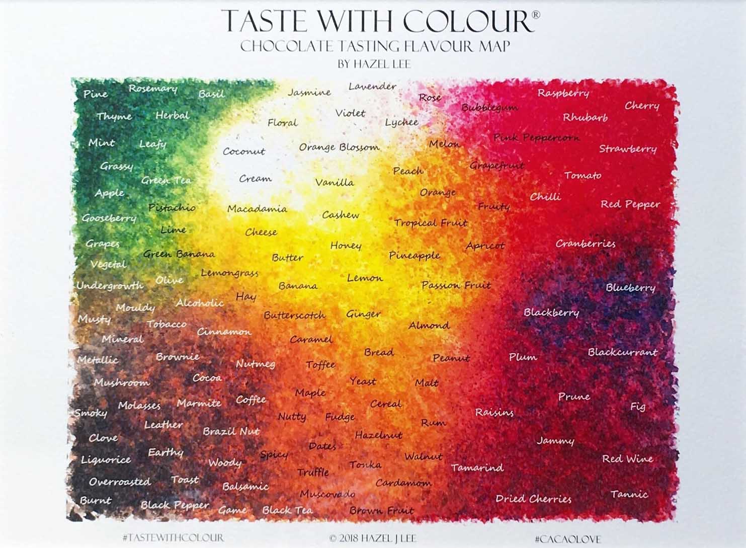
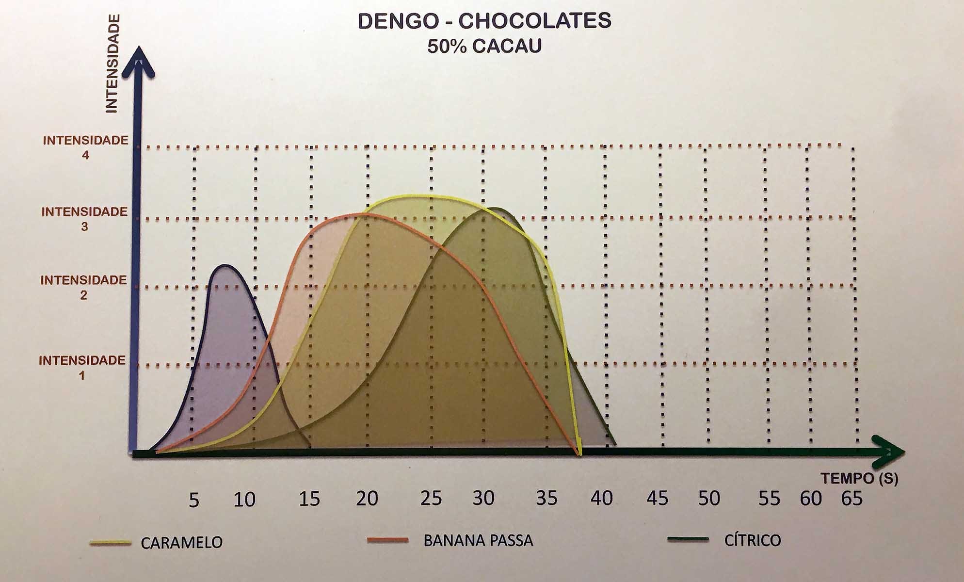
[L]: Hazel Lee’s “Taste with Colour” approach. [R]: Dengo (Brazil) introduces the dimension of time (2017). I have been using ADSR from electronic music as an analogy since at least 2015, inspired by talks by Ed Seguine.
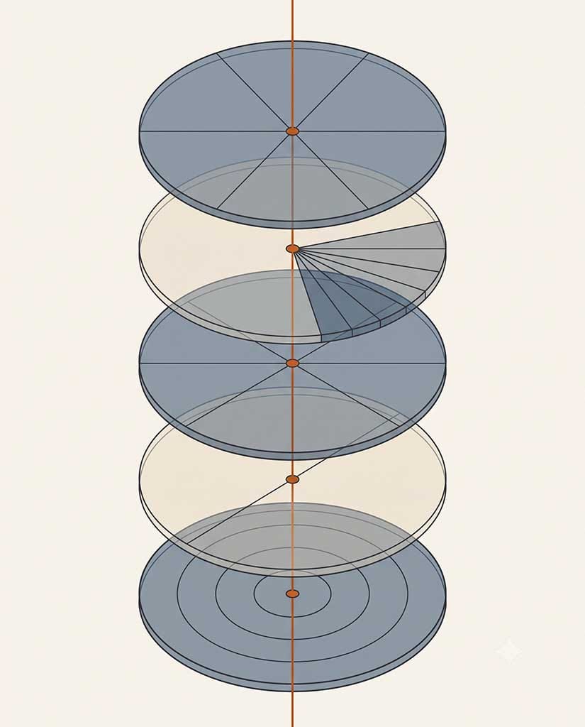
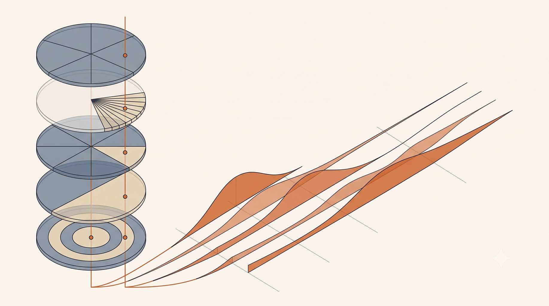
[L]: Experimental rendering showing different dimensions (or axes) of experiencing flavor, each with its own wheel. [R]: Experimental rendering extending the diagram to the left into the time dimension.
Recent Related Episodes
 Clay Gordon
 Clay Gordon
 Clay Gordon
Future Episodes
Celebrating(?) the 25th anniversary of the signing (on Sept 19, 2001) of the Harkin-Engel Protocol with special guest Terry Collingsworth, International Rights Advocates.
Episode Hashtags
#cocoa #cacao #cacau
#chocolate #chocolat
#PodSaveChoc #PSC
#LaVidaCocoa #TheChocolateLife
#PodSaveChocolate and #TheChocolateLifeLIVE Archives
To read an archived post and find the links to watch archived episodes, click on one of the bookmark cards below.
 Clay Gordon
Episodes 201-300 (links to older PSC archives are in the top nav).
Clay Gordon