Updated: Grading the 2022 Easter Chocolate Scorecard
Part of my responses to “ethical chocolate ‘white’ lists” – what careful observation can tell us.
Green. Yellow. Orange. Red. Grey and cracked.
These are the Easter eggs grades that chocolate companies are awarded by the NGO Mighty Earth and colleagues each year in their chocolate scorecard.
But what do the individual egg and overall scores mean? What do the results show – and what do they hide? To borrow and update a turn of phrase:
“Inquiring minds should want to know.”
How Low is the Bar Set?
A coveted green egg is awarded to a company that the researchers believe is “Leading the industry on policy.
Are they grading on a curve here? Is a green egg an ‘A’ (90+) and a red egg a ‘D’ (60-70)? What is the rubric used to take the information gathered and give it an egg color?
All of the eggs are presented free of context. On the actual scorecard itself there are no explanations about the criteria and the methodology used in evaluating the companies in the categories that are judged. I understand the excuse there is no room to present these key factors, but do we really believe that any significant number of readers is going to do any substantive follow-up research?
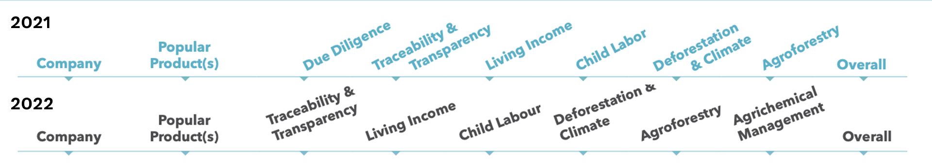
The image below is a composite of images taken from the 2021 and 2022 scorecards. As you can see, the categories have changed, as has their order.
In a discussion with one of the leaders of the group doing the research after the 2021 scorecard was released, I pointed out a couple of problems I saw comparing the 2021 scorecard with the 2020 scorecard:
1. Importance
There is an implied importance in the order of presentation – the first (left-most) category is the most important one. The right-most one the least important.
This turns out not to be the case, I learned. No real thought (in 2021) given to the order in which the results were presented and how that might influence how people interpreted the data.
2. Presentation Order & Dependencies
In the 2021 scorecard, entries are sorted alphabetically within each aggregate ranking. In the 2022 scorecard the companies are ordered by performance, which implies there is a numerical value behind each egg color. Whatever, these get summed together, with or without weighting each category, no way to know what the calculations actually are – or if the math is correct.
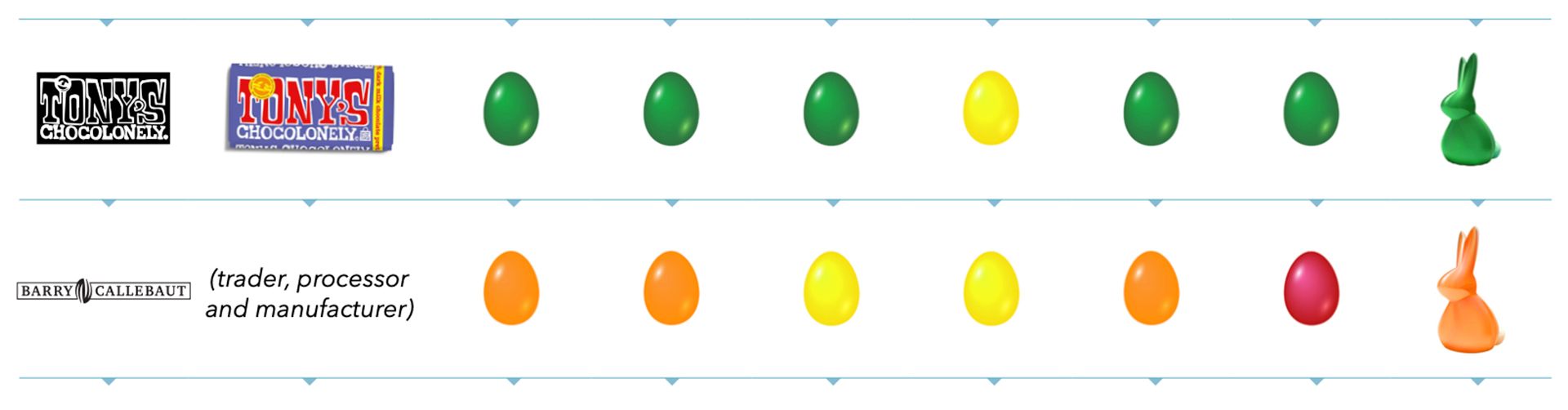
What this means is that in 2021, Tony’s Chocolonely’s green egg was on the same page as Barry Callebaut’s yellow egg. Astute industry observers will know there is a relationship between these two companies. This order of presentation makes this, if not obvious, at least directly comparable. In the 2022 scorecard, the orange egg (a backsliding from 2021 – see composite image, below) is on page 6, making the comparison much more difficult. But it does allow for some other comparisons – at least Barry Callebaut can brag that it got a better score than fellow candidate for “Belgium’s Finest” chocolate brand – Belcolade from Puratos.
There is another glaring example of this kind of dissociation – Alter Eco relies on Chocolats Halba as their manufacturing partner. Chocolats Halba’s aggregate egg color dropped from a happy green in 2021 to a much less honorable yellow one – and, it seems, dropped below Nestlé (gasp! Say it Ain’t So ...) though both received the same number of green, yellow, and orange eggs.
Sometimes relationship information is completely absent. For example, Glico, Japan’s largest confectionery company (ranked #16 in Candy Industry’s 2022 list) is the corporate parent of TCHO. Is TCHO’s performance in any way incorporated into the ranking of its parent? (I personally doubt that it is – but if I were TCHO I would be profoundly unhappy with this rating as it requires a lot of extra explaining.)
3. Reliance on Subject Matter Expertise
Quick! Without looking – What popular products are produced by Touton? Cargill? Cemoi? Puratos?
That information is not given. Instead, their roles in the industry are shown (see how BC is described in the image above). However, with everything being rearranged, all of the companies listed on the first page of results have products shown in pictures and, in the case of Ferrero, brand names as well.
Once you get past the first page, does the casual consumer know the difference between a processor and a trader and a manufacturer? How does someone without a huge amount of specialized expertise evaluate the claims being presented here?
Oh. That’s right. They can’t.
4. Lack of Scale Indicators
The combined purchasing and processing of cocoa represented by the top 3 companies on this list might be considered to be a rounding error or sweepings when compared with that of the defendants in lawsuits here in the US that are on the list.
This becomes important when evaluating actual meaningful impact.
Much as I admire the work the team at Beyond Good (formerly Madecasse) has done and continues to do – what is the depth, breadth, and size of their supply chain, from the farm to the factory? How much cocoa do they process? How many farmers and how many hectares of land are involved? I don’t want to diminish in any way this recognition or their work – but I do want to point out that the complexities of their supply chain are minuscule in comparison of those of much larger companies – and it’s not clear to me how, or even if, this is factored into the results.
I make the same observations of Tony’s. If you take a look at their most recent annual report you’ll find they sourced from fewer than ten cooperatives in two countries – and all of the hard work they rely on for their marketing claims is performed by an NGO, and “their” CLMRS is not really theirs, it’s the one ICI built. When you compare this with BC, for example, Tony’s supply chain is absurdly tiny. How much actual impact are they delivering to how many? Can what they do be scaled? While on the surface the answer is, “Why not?” in the real world there are many not factors that get in the way.
5. Black Box Methodology
In my interview around the release of the 2021 scorecard I learned that an important aspect of the interview process is not to push too hard. This is because the companies on this list volunteer to provide the information. If you push too hard, they might not be willing participants.
The only carrot is they might be listed as not responding. However – we aren’t told why a company did not respond? Did they ignore requests? Politely decline? Were they hostile to the entire endeavor?
Does the complete and utter lack of any explanation of methodology make the entire enterprise ... suspect? Inquiring minds want to know. And we will never know because I am fairly certain there are confidentiality agreements, formal and informal, in place and no FOIA process that would make it possible to find out.
I stand by my statement above that there is no easily findable active link to the methodology used to arrive at the published results on the scorecard itself. I looked closely and asked a colleague to do the same.
However, there is a published methodology one can read if one goes to a website that also does not appear to be actively linked from the scorecard.
While this document does explain how the data were collected and the numerical scores given to responses, there is no mention of the methods used to aggregate the scores and assign them to an egg color. We do not have the individual scores (even de-identified) and we do not have the algorithms – a classic black box.
In Closing ...
Could a green egg also be used to represent greenwashing?
There are many reasons why I think “‘ethical’ chocolate ‘white’lists” fail. That’s the reason I created the inverse, my Wicked List.
 Clay Gordon
This scorecard, while not totally useless, is, in actual fact, not all that useful in helping educated, critical, consumers make informed buying decisions.
In my opinion. What’s yours? What do you think of the arguments presented here? Did I overlook something? Overstate something? Make a false equivalence?
I fully recognize the challenges the researchers face. Collecting the information, evaluating the information collected, and then organizing it for presentation are daunting and highly complex. I know a graphic designer was involved, but was an information designer involved? Someone with more than passing familiarity with texts such as VDQI - The Visual Display of Quantitative Information?
But not doing better than done here has consequences. Unintended consequences, to be sure.
But you can bet that Tony’s Oh-So-Lonely! – after calling out Cadbury but not Barry Callebaut – will do their durnedest to whip a fancy French omelet out of a nothingburger by deliberately, disingenuously, misrepresenting what the report means.
And, unfortunately, the average consumer has none of the skills, experience, or interest to understand they’re being led down a bunny trail.
Leave them in the comments.